Work / Centron
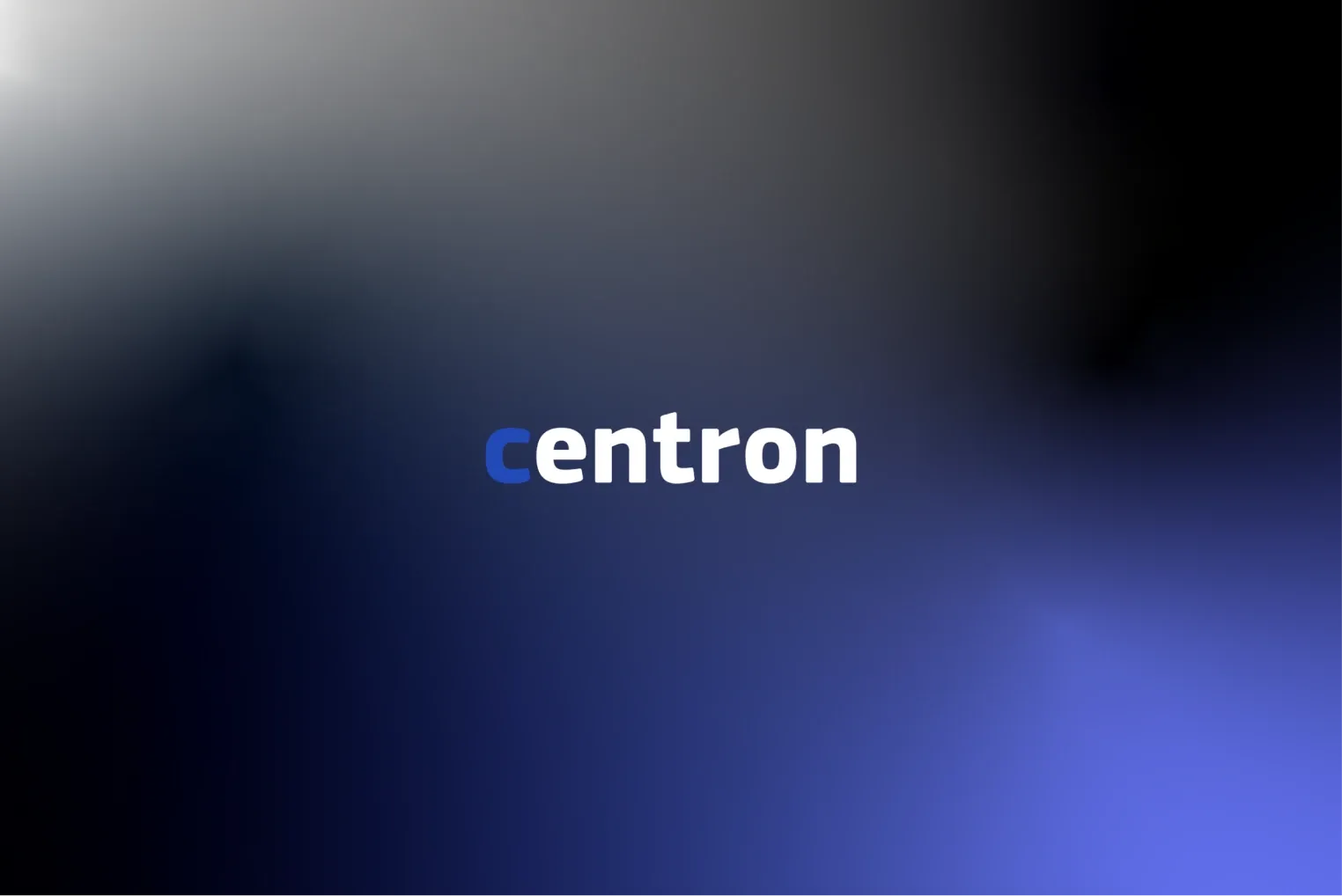
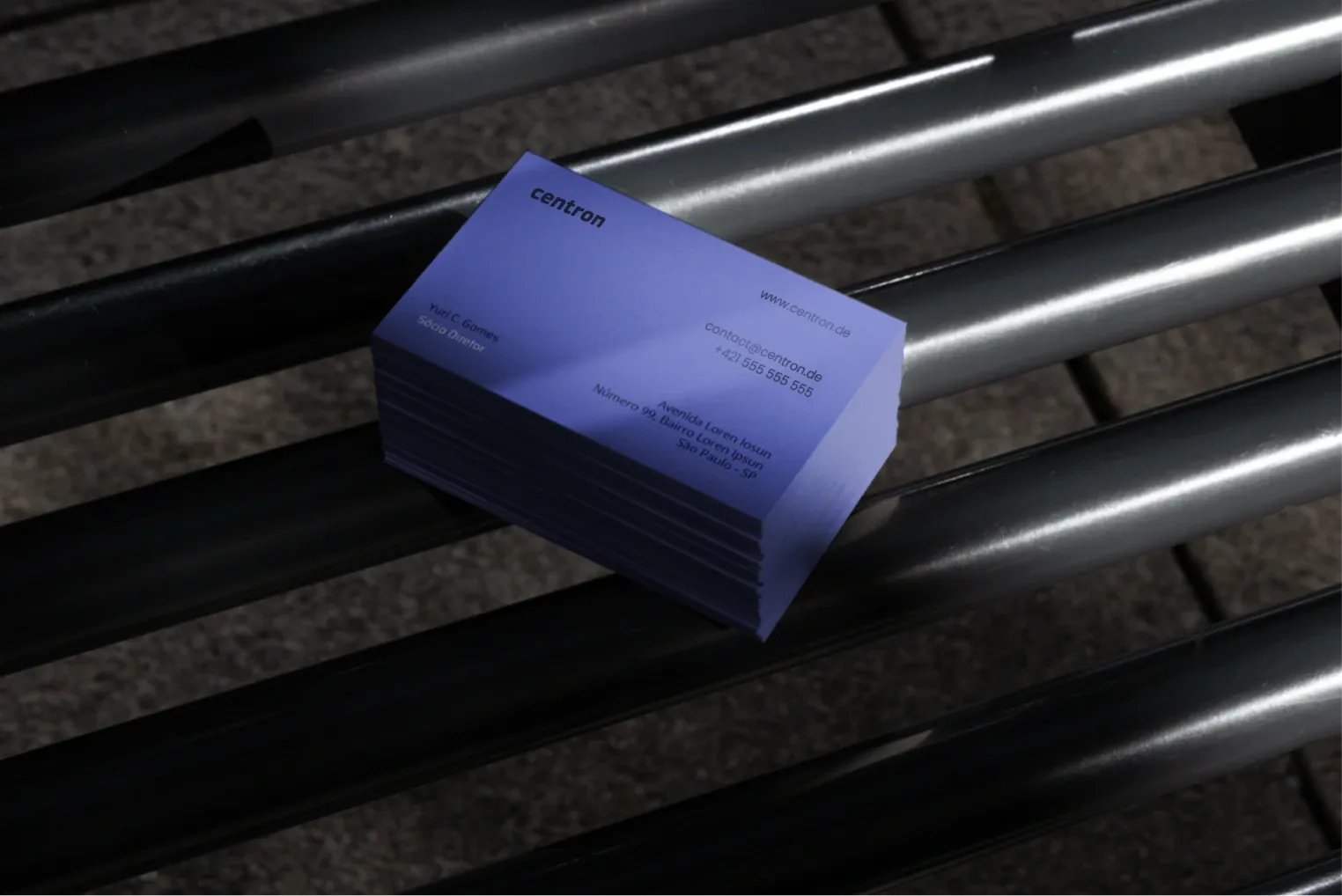
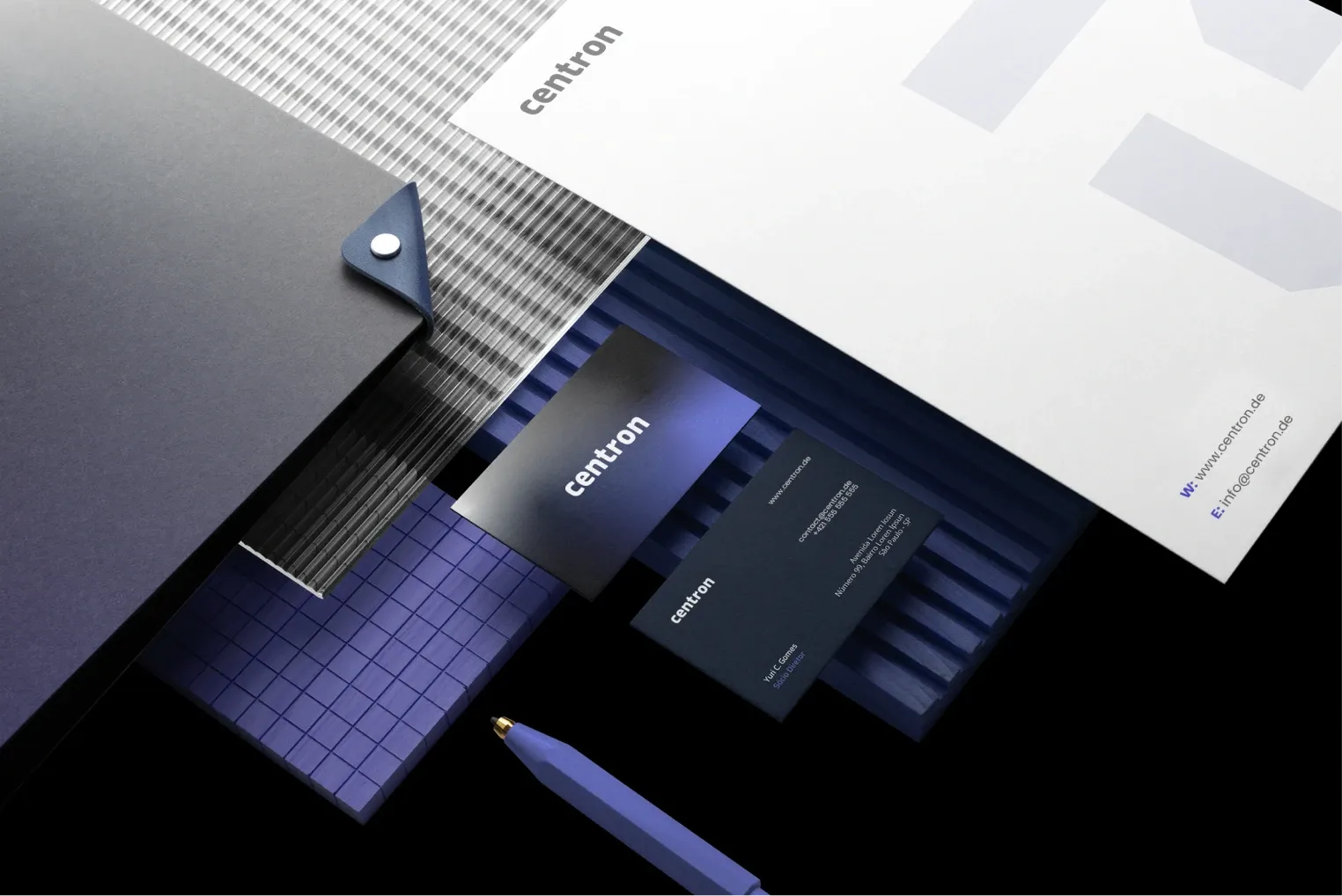
Visual identity for a technology company
Logo, digital visual system and website for an IT infrastructure company.
Centron builds and manages IT infrastructure that mostly nobody sees — as long as it works. The identity had to make the invisible visible: the symbol grows from a centre from which a network spreads, and the colour gradient evokes the flow of data. We designed the system for screens first and for paper second.