Work / Sempera
Sempera visual identity
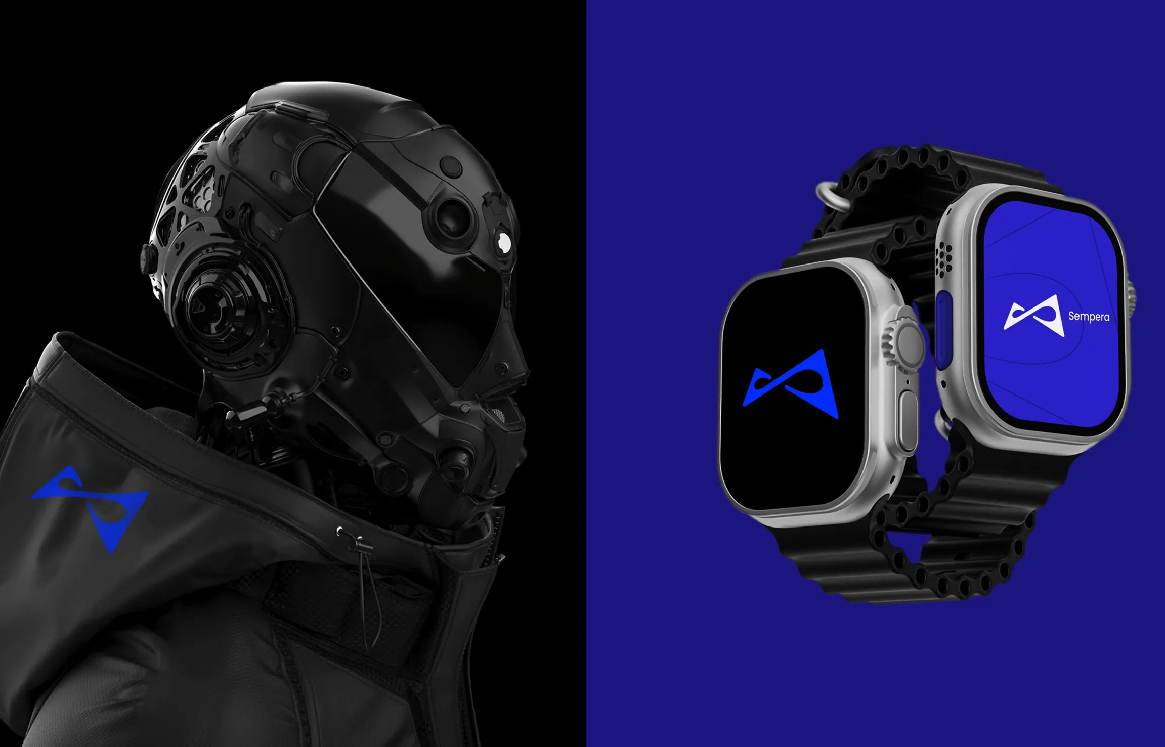
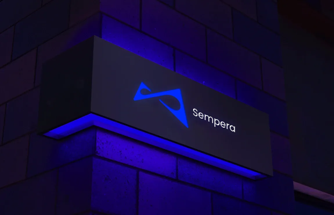
Symbol, colour system and brand applications from print to digital interfaces.
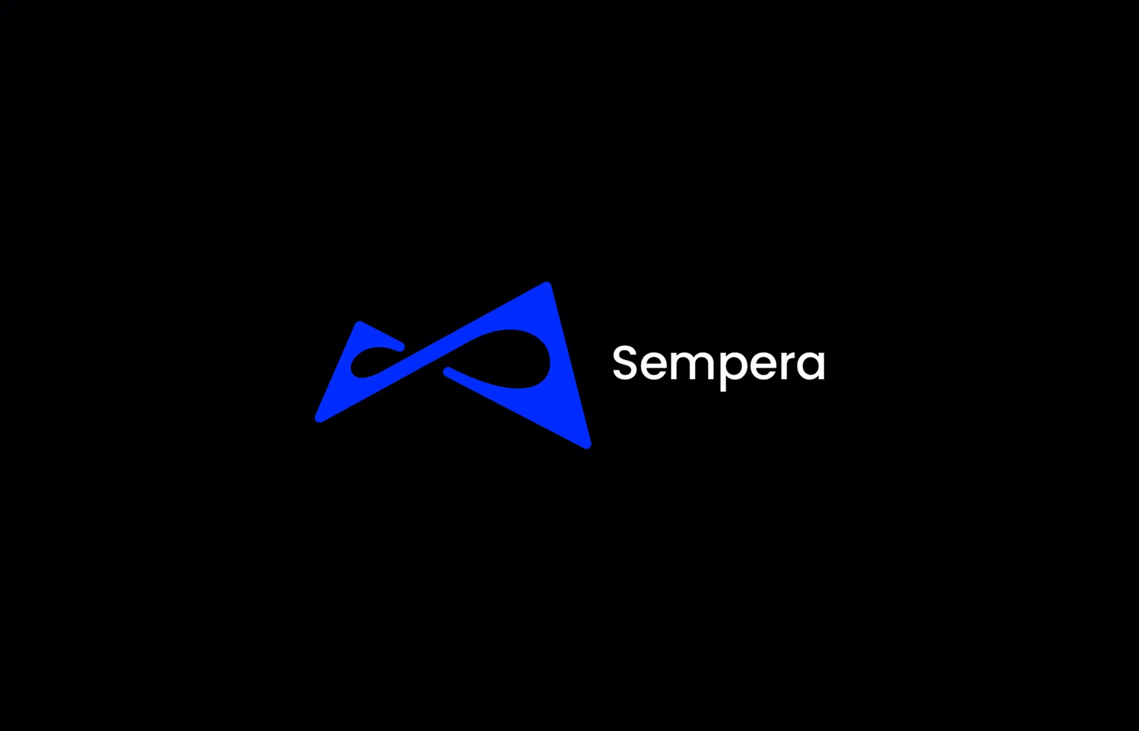
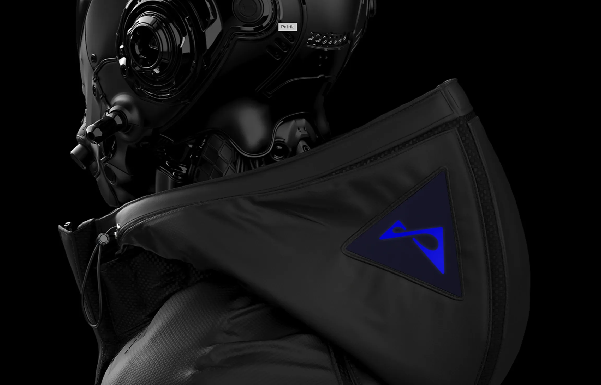
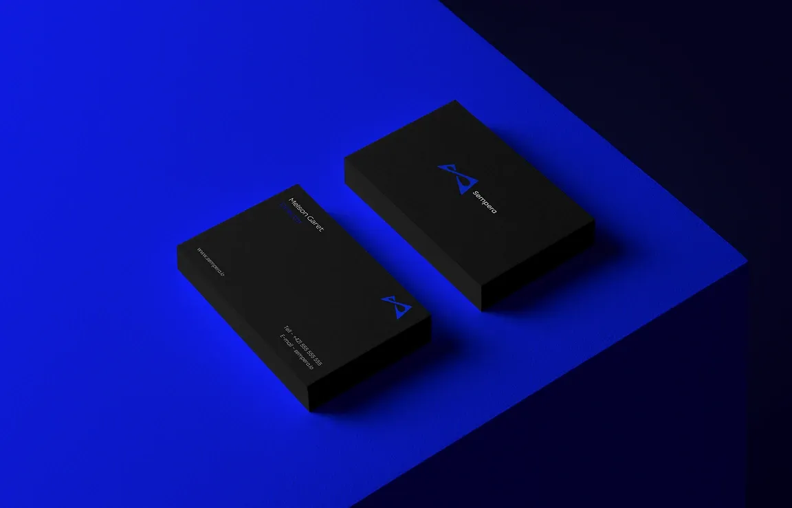
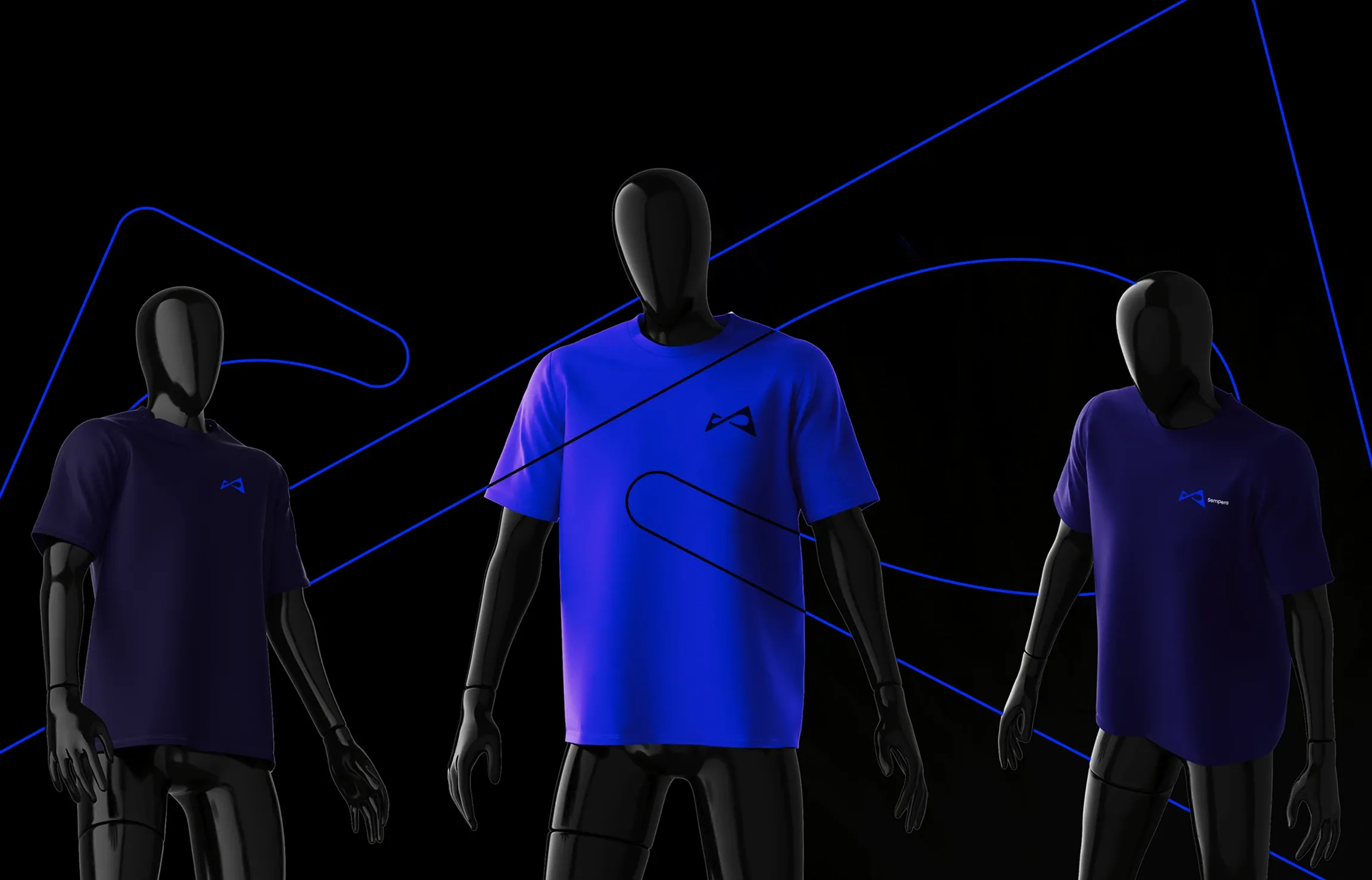
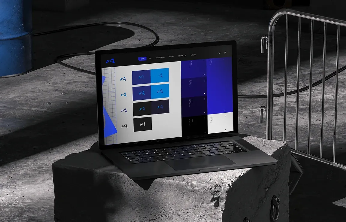
Sempera — from the Latin semper, always. The brand is built on the idea of permanence, so we constructed the symbol from simple geometric shapes on a precise grid. It stays the same wherever it appears: we tested the system from business cards and citylights through apparel to an app and a watch face.